01 Apr 2009
One of the most overlooked facets of many major sites is the actual organizational hierarchy. Too many designers and programmers just segment things into a few quick sections without doing any deep thinking on the issue, which can lead to major issues later.
In that vein, Audette Media has an excellent tutorial on the basics of Information Architecture for SEO. If your digital inventory of content and media isn't well organized, it won't just be hard to find for humans (leading to a higher bounce rate), it will also be shorted by search engines, leading to a loss of precious search engine position.
02 Mar 2009
Recently, the Washington Post published this article on the challenges that the Obama team is encountering in bringing its pledges of open government into whitehouse.gov.
The gist of the article suggested that the team is struggling to work out a solution to making the text of proposed government action (particularly legislation up for signature) available and commentable. This got me thinking about how I might try to meet the challenge.
The way I see it, they have to present the text in a way that is:
Easily indexed, bookmarked, and searched
Easily commented on, with particular emphasis of reputation and identity of the commenter
Easily edited, with the changes legally required to be tracked
This immediately got me thinking of the best interfaces I've seen to work under these constraints, namely the Django Book and Wikipedia.
The Benefits of Granular Edits and Comments
The interesting thing about the Django Book is that it offers commenting on by section (usually a paragraph or group of paragraphs on one subject). The benefits of this approach as opposed to commenting on an entire 1000+ page document, or even a single page, are obvious, and the structure of bills lends itself naturally to this approach. In fact, the bills, by nature, are already broken up into logical sections, making manual or programming section-splitting unnecessary.
What might this look like in practice? I've marked up a few fake pages ((Click an Image to see the full size version. I've broken a few UI best practices here with respect to coloring links for example's sake. Caveat Emptor)) to serve as examples:


Tracking Changes
According to the Post article, the law mandates that changes to documents be archived, and it makes sense to make them available. Thankfully, web 2.0 culture has a few handy solutions to this, the most obvious being a closed wiki-style revision system for each section.
Upon clicking a link provided in each section, the user could see all past revisions of the section, and the date of the change(s). Technologically this is fairly trivial to do, in fact there are even entire database systems evolving around this kind of versioned content concept.

Handling Identity and Authority
One of the biggest challenges in providing open content is avoiding the youtube effect. Informed commentary is hugely beneficial, but low-value content like jokes, youtube style "OMG lOl teh lAW", etc, are inevitable. This is a particular problem for an official government site, since the content must be kept to a minimum standard, but the slightest allegation of censorship would be discrediting.
To battle this, we can take a page from the playbook of Amazon.com and their "real name" system. Any normal user could post, but users willing to go the extra mile ((I believe Amazon bases theirs on credit card information, but something state-ID based would be plausible as well)) would gain the ability to post without review, and have special icons or backgrounds showing their status.
[caption id="" align="alignnone" width="592" caption="An Example of A Review with Amazon's RealName Verification"] [/caption]
In this case, users would presumably want to attach additional weight to certain classes of commenters. At the bare minimum White House employees, Congressional/Senatorial staff members, etc. could post with considerable additional authority. Allowing users to filter un-verified commenters would be beneficial and simple to implement as well.
On a wider level, extending the system to those who can prove having a Doctorate, Law Degree, or Elected Position would be informative. This particular idea seems to suffer from serious scaling problems, but Amazon seems to handle it, and there are only 435 House members and 100 Senators, so an initial 550 or so accounts is doable in a short amount of time.
Searching, Printing, and Tracking
The final step to full a 'web 2.0'-ing of the process involves improving search access, and adding functions allowing the computer savvy to remix the content.
Searching should work by bill or by date, and allow optional searching of comments and previous revisions.
Each subsection could offer an RSS feed, as well as overall feeds for each bill and for comments. This would allow programmers and journalists to easily watch for edits to a bill, as well as comments made by reputable sources.
Imagine being able to watch a bill and see a google reader alert noting that it was changed this morning in response to a comment-criticism by prominent judge Richard Posner, or that a major piece of pork was added to an appropriations bill. The implications for government transparency are staggering.
It's probable that 90% of users won't use a single one of these functions, but they would make the job of the vocal minority who do (journalists, bloggers, etc) considerably easier, which means wider dissemination and offers benefits for everyone.
Those who can; do. Those who can't; blog.
I'd like to point out that I have nothing to do with the administration or their web team. Additionally, I've never seen all these features together in a production system, nor do I have to build it or pay for it.
This makes daydreaming about features notably easier =).
That said, everything I've gone over is not only technically feasible, it's already in production in extremely large-scale sites, and most of it is already implemented in various free software projects, so it can be done.
Technology has an opportunity to bring the people closer to the U.S. government than ever before, but implementation is really make or break for government involvement, not to mention the public's perception of the government (see: Internal Revenue Service, The).
Have any other ideas for how the interface to the bill system might work? Leave a comment below and let me know.
07 Jan 2009
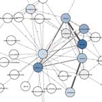
 British newspaper The Independent has an interesting feature called 'Mapping the Crisis', featuring a node-link graph (which I've mentioned before) attemping to map the articles and discussion from the paper's coverage of the current political situation in Israel/Gaza.
<!-- more -->The navigation is a bit unwieldy, but it is a neat take on trying to connect article facts and user comments on disparate (but related) stories and site content.
More information on some nodes is provided by popups, although clear citations and links seem to be lacking, perhaps they're just getting intercepted by my pop-up blocker; hard to say.
Regardless it's worth checking out, and even if this example falls a bit flat, it's still nice to see a paper trying to 'connect the dots' in novel ways.
02 Jan 2009
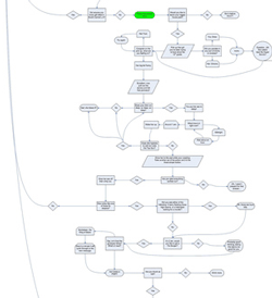 Reddit User Chknbone dropped this little New Year's present the other day and I thought it was too cool to leave unshared.
It's a flow chart of the Ice Cube song Today Was A Good Day (NSFW Language). Classic rap makes for some amusing grammar and linguistic feats, and seeing it mapped out here is a good laugh, not to mention an amusing stretch of the flowchart metaphor.
So check out the original at flickr, and here's to more cool stuff in 2009!
29 Dec 2008

Axis maps blog is sharing an interesting technique for adding another dimension of data to maps by using transparency. Somewhat like a cartogram, they've taken each county in the US and modified it based on population density, but instead of stretching it to a new size, they've increased the alpha transparency to make more populated areas brighter and less populated areas faded out.<!-- more -->
It looks like a challenge to get the color mapping right, especially in light of data that has a few outliers compared to a large area of uniform low density like population. Perhaps a logarithmic scale would be more useful for data like this.
Regardless it's a novel highlighting method, and definitely one to keep in the toolbox in the future. I could also see this being useful for highlighting in non-map visualizations such as treemaps.
There are a few more examples over at the original post, so check it out!


